Good morning, friends! I'm back today with a
Papertrey Ink Transformation Tuesday post to share with you. I have a confession to make. I haven't liked my original card from the moment I created it for the last countdown. It's true; sometimes we all make cards that we simply don't love once they're finished.
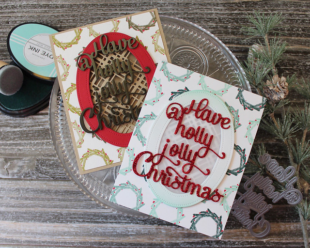
I liked all the individual parts of this card (the layout, the colors, the products), but once they were all put together I wasn't pleased. So I decided to give this one a makeover! Let's take a look at how I "fixed" my original design.
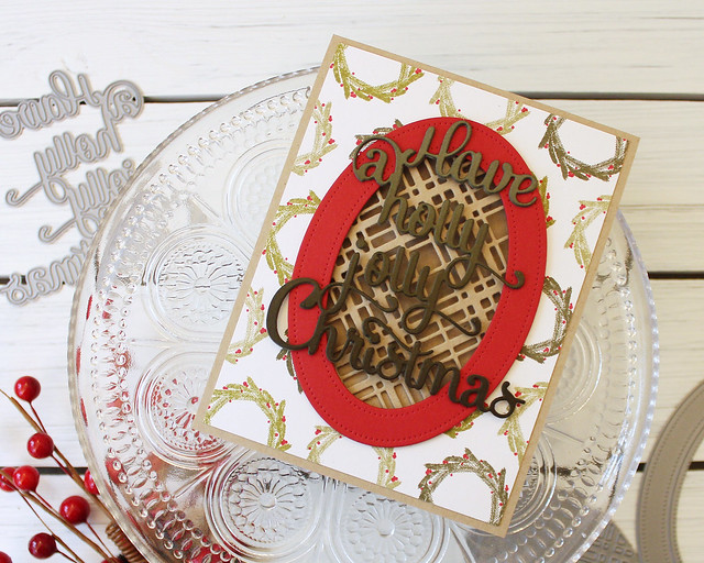
I think my displeasure stemmed from the fact that my original card ended up being too dark and simply not festive enough. It also didn't have any pizzaz and I felt like the plaid window was competing too much with the die cut sentiment (probably because they were so similar in tone).
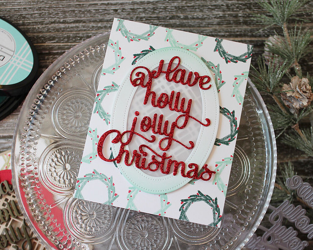
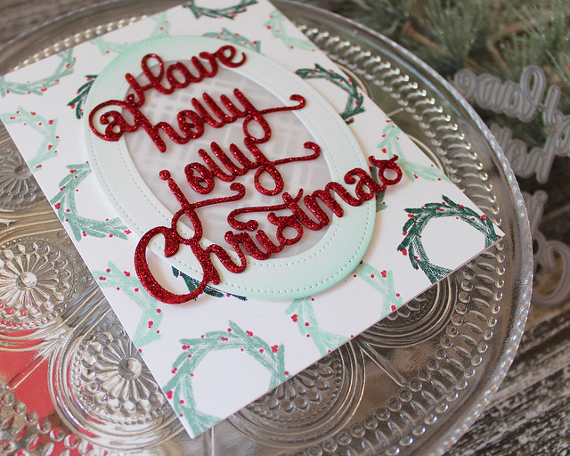
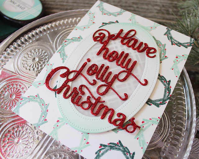
So on my second version I decided to opt for brighter colors, a healthy dose of glitter (naturally), and a little vellum to soften the pattern a bit (and hide the message that will eventually be written inside). I also wanted to simplify the design slightly and remove the extra, unnecessary layer, so I decided to stamp the wreath pattern directly on the base this time.
I also chose to swap the ink blending on the sentiment for ink blending on the frame. The solid color on the original card was just a little bit bolder than I wanted it to be. Also, the blending on the sentiment didn't help the "it's too dark" issue as it only served to make it darker and heavier and...ugh.
Enter glitter. Have I mentioned that I love glitter on holiday cards. It's true. I usually sneak some in here or there, but on this one I went the "all glitter, all the time" route and I'm not sorry. I just xyroned the Pure Poppy cardstock before die cutting and then coated the entire greeting once I had stacked the die cuts.
There you have it. So much better! I'm very happy with the second version and I think it feels much more "me." Thank you for joining me for this week's Transformation Tuesday! I hope you'll head over to the
Team Blog to link up your own transformed project. There's a $25 gift card on the line after all. Have a great week and I'll see you soon for Festive Friday!
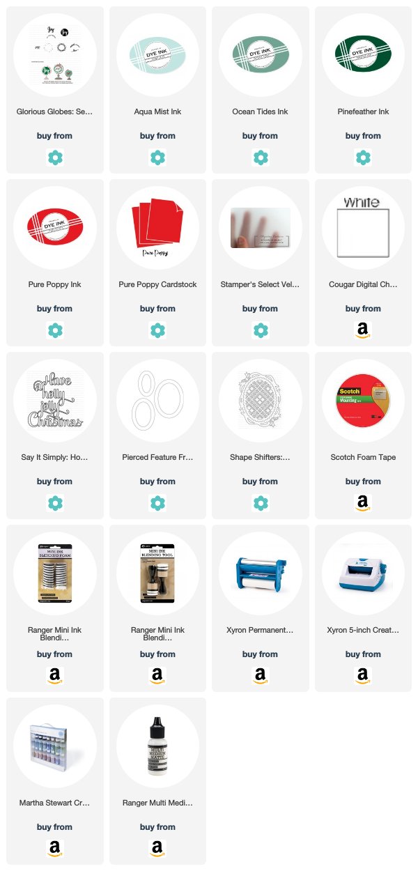
Supplies:
Holly Jolly Christmas Card


2 comments:
Hi Lizzie! Honestly like them both. The first has a rustic feel, with the colors, and the 2nd lighter and more festive! Love how you stamped the wreath all over, accenting a few with darker hues.
Such a wonderful makeover, Lizzie! I completely agree with you! The new card is bright & festive & I just love how the sparkly sentiment shows up! You've inspired me!
Post a Comment