Good morning, friends! I'm popping in today for this week's
Papertrey Ink Design Team Tips. I love using die cuts to create negatives in a stamped design, but sometimes the holes in the pattern leave unfortunate gaps that make the greeting illegible or the shape askew. My favorite way to help minimize those gaps is not only simple, but incredibly effective. A little sponging goes a long way, friends! I have three projects to share with you today that show this technique and the different looks you can achieve. Let's go!
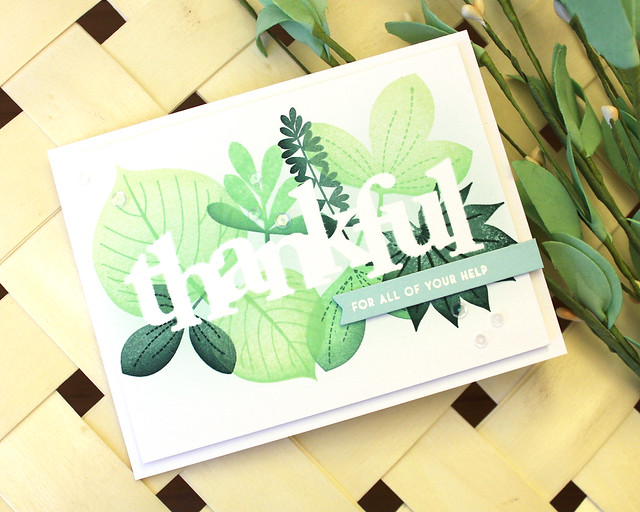
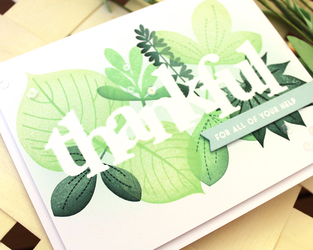
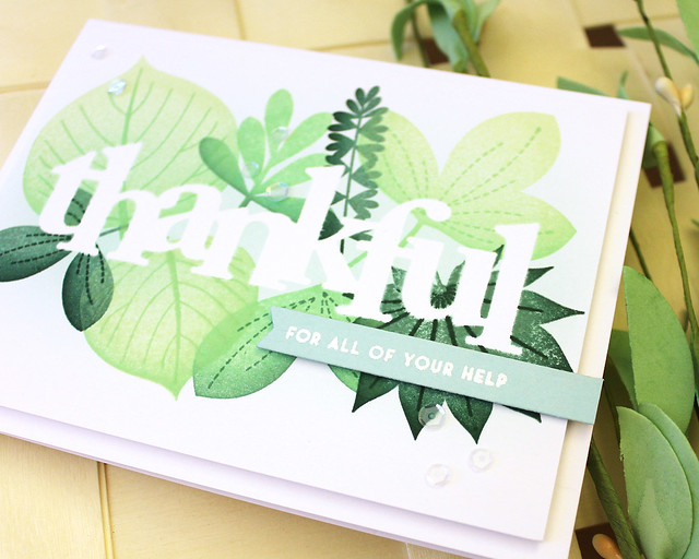
This first one shows how the sponging can make a negative word a little more legible. It defines the edges in the areas where the leaves (or flowers, or stars, or whatever image you choose to use) don't overlap the die cut.
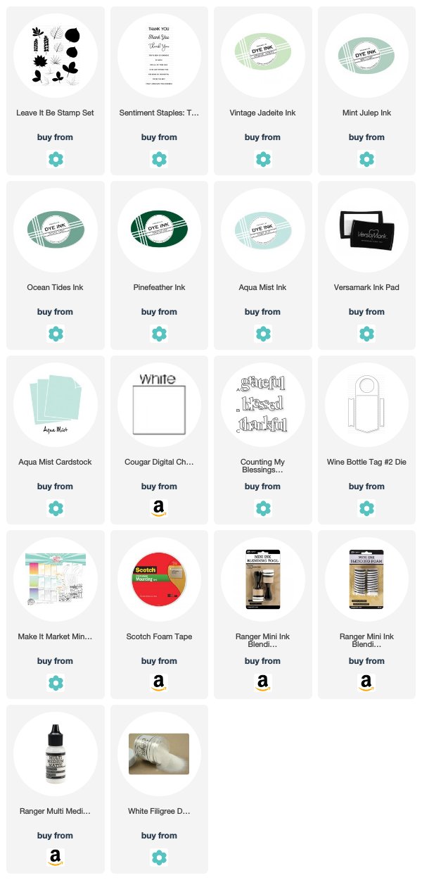
I began by die cutting the
Counting My Blessings "thankful" shape from full-stick Post-It notes. I like these notes because you can get a nice seal between the Post-It and the cardstock which keeps the die cut from shifting during the blending step. I blended with Aqua Mist ink on this one. I tend to choose the color of my blending based on the colors I'm going to be stamping for my pattern. I thought the light blueish color would look nice behind the leaves I planned to stamp.
Speaking of those leaves, they're from the
Leave It Be stamp set (which just happened to land on the
Last Call list, so make sure to get it before it's gone). I used Mint Julep, Vintage Jadeite, Ocean Tides, and Pinefeather inks on the leaves, sponging lighter colors with darker ones to add depth.
I removed the mask and adhered the panel to a white card base using foam tape. Then, I heat embossed a greeting from
Sentiment Staples: Thank You onto an Aqua Mist banner. I adhered that to the card front with more foam tape and then embellished with a handful of sequins. They add just enough sparkle, don't you think?
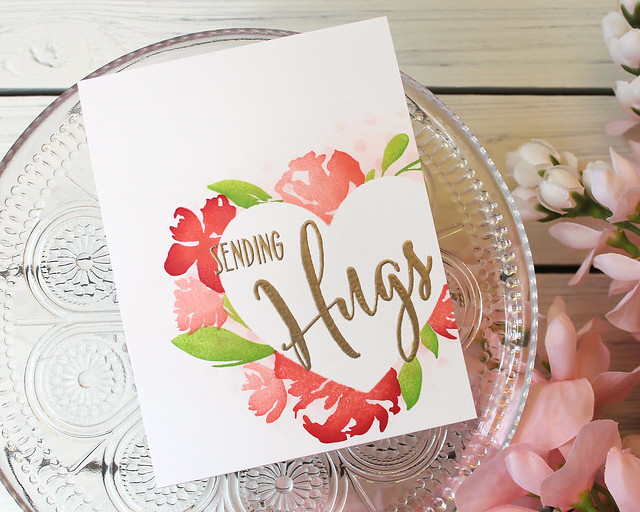
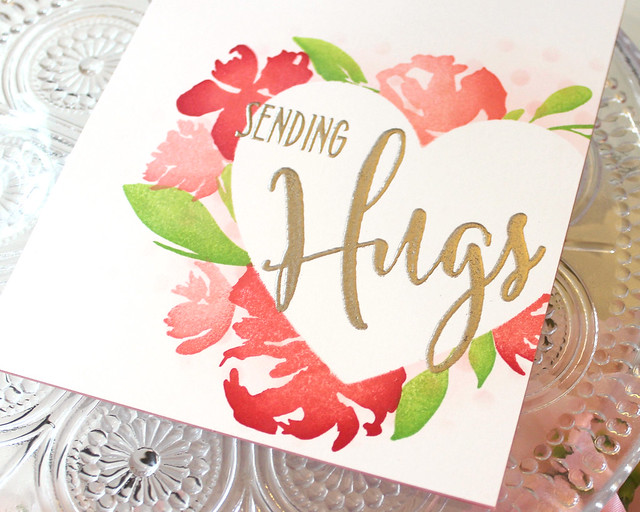
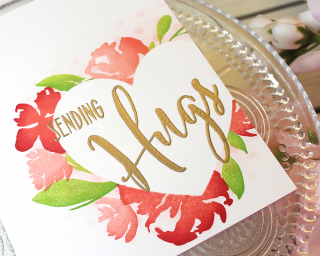
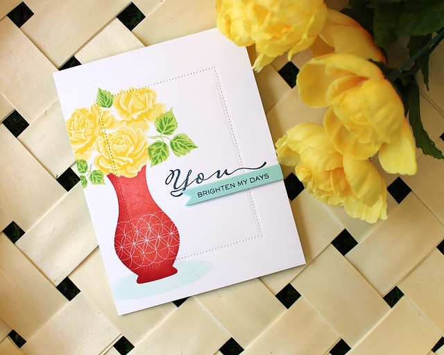
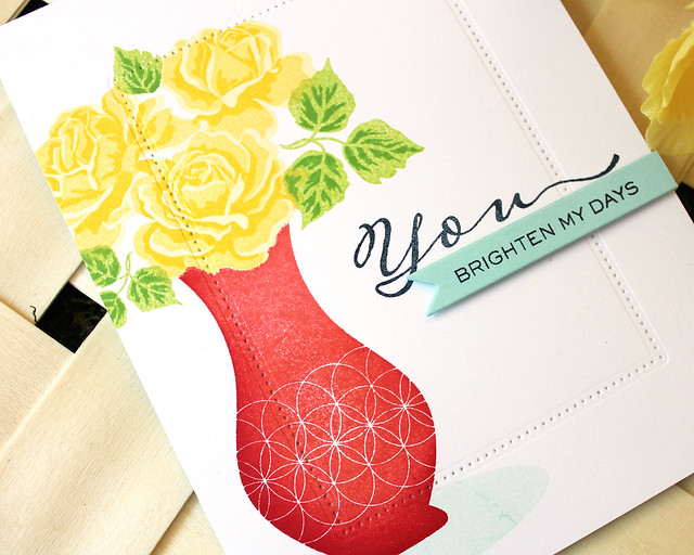
Next up, I have an example of stamping around the outer edge of a shaped die cut. Again, the sponging helps define the edges and fill in the gaps in the stamping. If you tried to completely overlap the images the design might get too cramped or busy, so the sponging gives you a little breathing room.
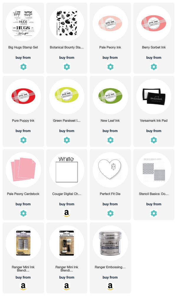
I began this card by die cutting the
Perfect Fit shape from the same Post-It notes I mentioned before. I stuck it to a white panel and blended on a bit of Pale Peony ink. I also sponged a bit of ink through the
Stencil Basics: Dots stencil to give my design an added touch of texture.
I continued by stamping the
Botanical Bounty flowers and leaves around the outer edge of the heart shape. Again, if you don't want to overlap too much or crowd the images together the sponging will fill in the gaps so your masked area will still maintain its shape.
Once my stamping was complete, I removed the mask and heat embossed the
Big Hugs sentiment in the opening. Then, I adhered that panel to a Pale Peony card base. One of the things I like so much about this technique is that you can create a card with loads of interest, but it can be nice and flat and easy to mail. No bulk required!
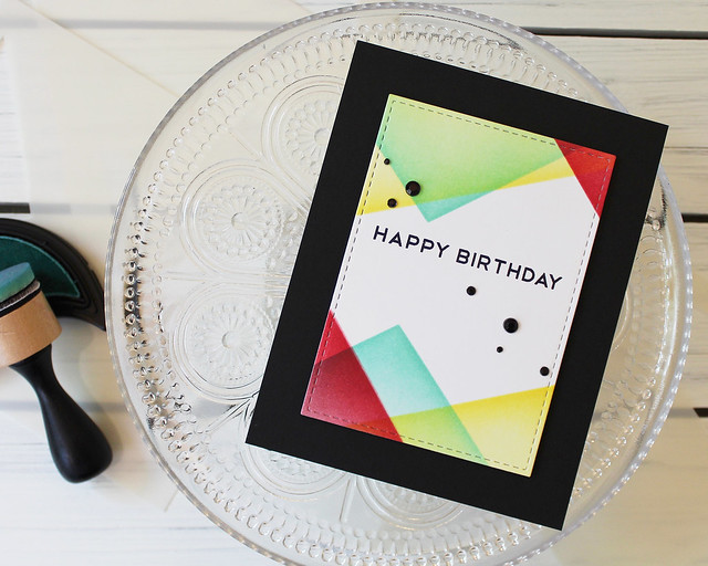
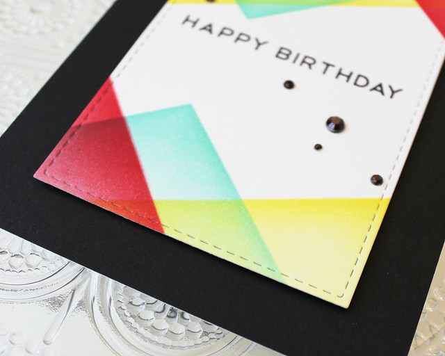
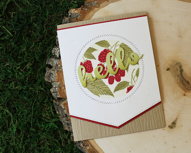
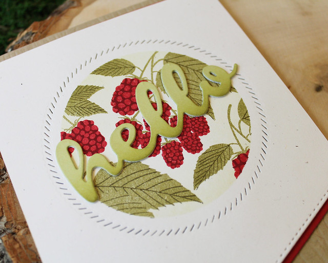
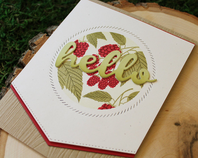
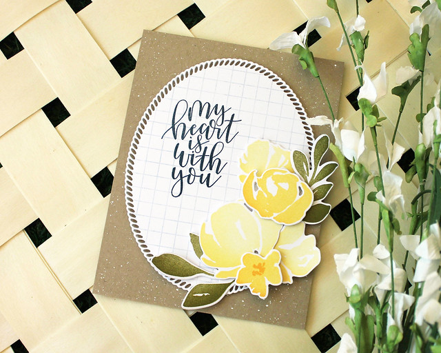
My last sample shows how you can use this same concept on the inside of a die cut shape (if you're, say, using the negative as your mask). Again, it's an ideal way to define your edges without having to add an extra layer of cardstock.
I began this one by die cutting a circle from a piece of text weight paper (I've also done this with vellum and that works well, too). I placed it on a Rustic White panel and then blended Spring Moss ink from the outside edge toward the center of the circle. I did a pretty light coat, so it might be a little difficult to see in the photos, but it makes a huge difference in person.
I continued by stamping the berry clusters from
Beautiful Berries: Summer before removing the mask and using the
Shape Shifters: Circle 2 border around the stamped area. Then, I die cut the bottom edge of the panel using the
To The Point Edgers die and matted the top and bottom with Pure Poppy cardstock. I like the way the narrow Pure Poppy bits tie in to the berries without being overwhelming.
Next, I adhered the panel to a Classic Kraft card base that I'd textured with the Woodgrain Impression plate. I created a nice bold greeting by stacking three
You Deserve Flowers Sentiments die cuts. I cut the top shape from Spring Moss and sponged it with a bit of the matching ink to add depth.
I hope this little tip has helped you today. Thank you so much for joining me. Have a wonderful weekend and I'll see you again very soon!
Supplies:
Thankful Card
 Sending Hugs Card
 Hello Card