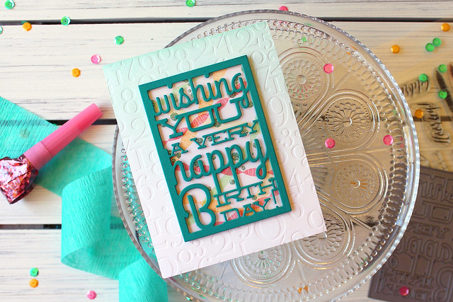
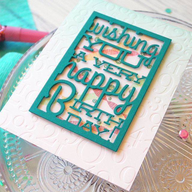
Despite loving my original concept, I was never completely happy with how the card turned out (and my photography also could have used some work, if I'm being honest with myself). I felt like the scene behind the Text Block was too busy and dark and took too much attention away from the celebratory greeting. I made several subtle changes that made a big impact on the new card. Let's take a closer look!
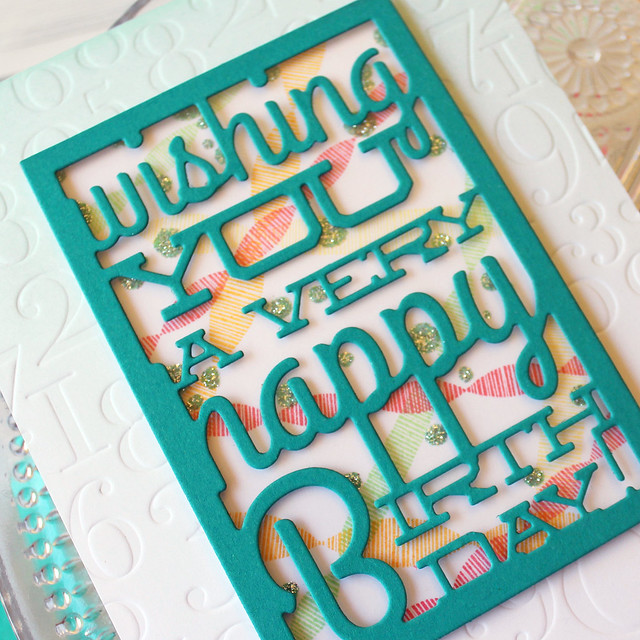
I also chose to glitter the confetti dots to make them stand out better and add festive sparkle. I felt like they really got lost in the blending on the original card. Another change (that you can't really see) is the layer of clear cardstock behind the Text Block. That helps stabilize the delicate text on the Text Block and, bonus!, seals in the glitter so it won't come off on my recipient's hands. I just ran the Tropical Teal cardstock through a Xyron before die cutting it and then applied that to the clear cardstock. No sweat!
I didn't want to lose the blending on the new version of the card, so I instead chose to add a very light Aqua Mist layer to the base. I like how it highlights the texture of the impression plate (I used the same By The Numbers plate this time around) and just adds some nice, subtle interest to the card base.
So what do you think? Do you have a preference? I hope you've enjoyed today's post. Don't forget, you can play along with your own project. Link up your Transformation Tuesday project over on our team blog for your chance to win a $25 gift certificate for the Papertrey Ink store! I have another something coming your way this week, so stay tuned! Have a great day, everyone!
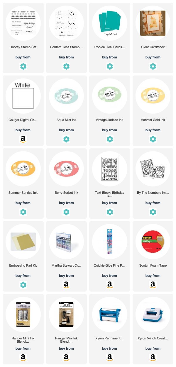
Supplies:
Text Block Birthday Card


4 comments:
I love this new challenge! Gotta say, seeing both your cards I'm really drawn to the new one, Lizzie--more festive feel to me! Eliminating the ink blending behind the text block made a huge difference & I love the change! Can't believe you actually fussy cut all those banners--haha! Thanks for the inspiration!
I remember liking the first one, but I sure love your new one. Everything is so much clearer. You can read the text with ease now, and I feel like you did an amazing job keeping all the elements you had, but just in a better way. I love this new PTI feature!
Great lesson here. Sometimes simpler and less is better than more. Both cards are lovely but #2 the feature sentiment really pops.
Lovely transformation Lizzie! Thank you for the challenge and opportunity to refresh our previous projects~
Post a Comment