Are you ready for the next challenge, Papertrey fans? This time around we're playing with sketches, or "patterns," created from some of our favorite cards. Here's my pattern:
You can find the original card on THIS POST.
I have a couple of brand new cards to share with you today that use this same pattern. Papertrey has so many fantastic tag dies available that you can totally change the style of your card with a simple swap. I love that versatility!
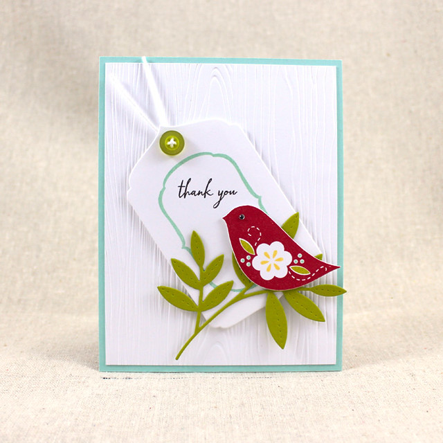
My first card today is a jaunty thank you card.
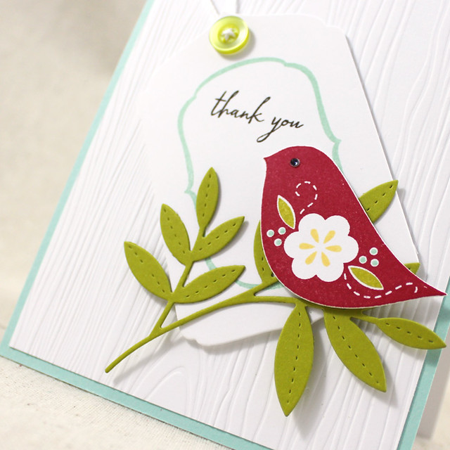
I started by die cutting and stamping the Songbirds bird and die cut the branch from Simply Chartreuse cardstock. Then I die cut the Tag Sale #8 die from white cardstock and stamped it with the Fillable Frames #8 frame using Aqua Mist ink. I added the sentiment from Songbirds in Smokey Shadow ink and embellished the tag with a Simply Chartreuse button tied with white crochet thread.
Then, I textured a white mat layer with the Woodgrain Impression Plate and adhered it to an Aqua Mist card base. I added the tag to the card front with foam tape and then adhered the branch and bird into place. The bird looked a little vacant with that blank eye, so I used a black rhinestone to embellish his little peeper.
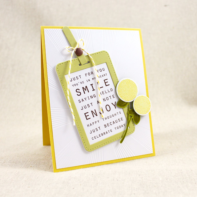
My next card is a little just because number that incorporates a flower sprig from Dawn's Fall Florals set. I love these flowers! They remind me of billy ball flowers.
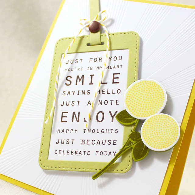
I began by die cutting the Tag Sale #11 from Spring Moss and white cardstocks. I stamped the Sentiment Signs sentiment onto the white tag using Dark Chocolate ink and layered it with the Spring Moss piece. I used an aged copper brad and button twine in place of a button when I assembled the tag strap.
Next, I die cut the Fall Florals pieces from white and Simply Chartreuse cardstocks. I stamped those shapes with their coordinating images in Ripe Avocado, Lemon Tart, and Harvest Gold inks. I textured a white cardstock panel with the Sunrise Impressions 2 Impression Plate and adhered it to a Harvest Gold card base. I attached the tag to the front of the card and then added the floral sprig, both with foam tape.
So there you go! How will you switch up the pattern? I can't wait to see! Make sure to check in with Amy, Ashley, Betsy, Dawn,Heather, Laurie, Lexi, Maile, and Melissa to see how they're revisiting their favorite sketches today, too!
Recipes:
Thank You Card
Thank You Card
Stamps: Songbirds, Fillable Frames #8 - Papertrey Ink
Cardstock: Aqua Mist, Simply Chartreuse - Papertrey Ink
Ink: Pure Poppy, Aqua Mist, Harvest Gold, Smokey Shadow, Simply Chartreuse - Papertrey Ink
Other: Tag Sale #8 Die, Songbirds Die, Woodgrain Impression Plate, Simply Chartreuse Button - Papertrey Ink; Foam Tape - Scotch; Mini Self-Adhesive Rhinestone - Mark Richards; White Crochet Thread
Just A Note Card
Stamps: Fall Florals, Sentiment Signs - Papertrey Ink
Cardstock: Spring Moss, Simply Chartreuse, Harvest Gold - Papertrey Ink; white
Ink: Ripe Avocado, Dark Chocolate, Lemon Tart, Harvest Gold - Papertrey Ink
Other: Fall Florals Die, Tag Sale #11 Die, Sunrise Impressions 2 Impression Plate - Papertrey Ink; Lemon Baker's Twine - Divine Twine; Antique Copper Brad - American Crafts; Foam Tape - Scotch


Gorgeous crisp cards,not sure I want to mix up the patterns when yours looks so good :)
ReplyDeleteBoth cards are so clean and crisp. I rarely use birds but that little guy is pretty cute.
ReplyDeleteI really like this card pattern. A lot of times I want to put a tag on a card but don't know where to put it. Putting an element over the tag kind of grounds it. I really like your cards and you were great in the Vogue video!!!
ReplyDeleteLove both of these cards, Lizzie. I also have a hard time using a tag on a card, but you certainly don't!
ReplyDeleteLizzie, you've got a way about making that side image/accent just pop!
ReplyDelete