Good morning, friends! I hope you had a lovely holiday weekend. It's my turn for this week's Papertrey Ink Transformation Tuesday, so I thought I would revisit a card that I really didn't love from last year.
Do you ever finish a card and immediately wish it had turned out differently? The original card is one of those for me. I wasn't thrilled with the lack of balance; it felt too top heavy. I was annoyed with the way the vellum had warped when I did my embossing. And I wasn't pleased with how subtle the Cover Up: Quatrefoil background had ended up. The revamped card incorporates many of the same supplies, but combines them in a new way with fresh supplies for an update that makes me much, much happier.
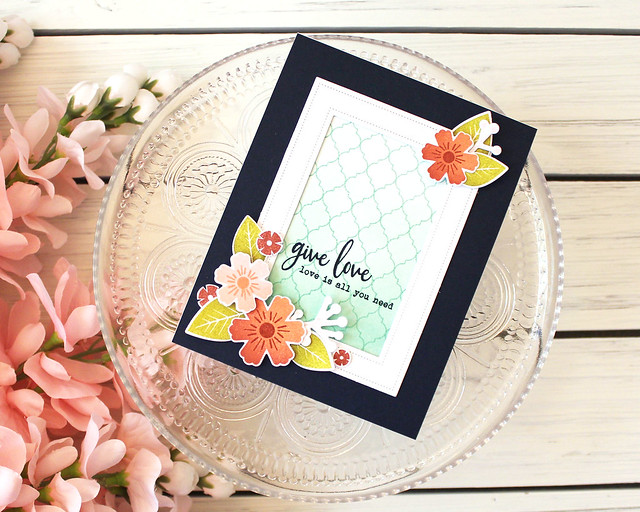
I knew I wanted to use the same stamp sets and color scheme because those were parts of the original card I actually liked. It was the layout and techniques that I didn't love. So I began by taking a look at the layout options that had opened up since I made the original card. The Pierced Feature Frames seemed like a fantastic option to use more of the space than the original circle. The open area gave the Cover Up: Quatrefoil more space to shine and seemed to provide more overall balance. I also added a few more flowers and leaves to help with the balance, this time giving them a sponged effect for a more interesting finish.
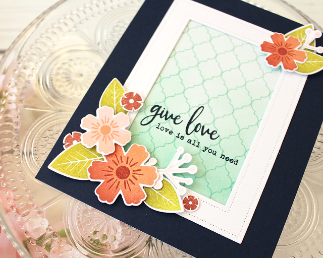
Speaking of the Cover Up: Quatrefoil, I hadn't been happy with how subtle the background was on the original card. It felt a little washed out. So this time, I stamped in color over the blended background instead of doing an emboss resist. It's a much stronger look and I think it shows off the pretty background much better. Doing the background in this way, I was able to lose the warped vellum sentiment strip, too. I simply stamped in Dark Indigo straight onto the patterned background.
I hope you've enjoyed today's card transformation! Have a wonderful day and I'll see you again soon!
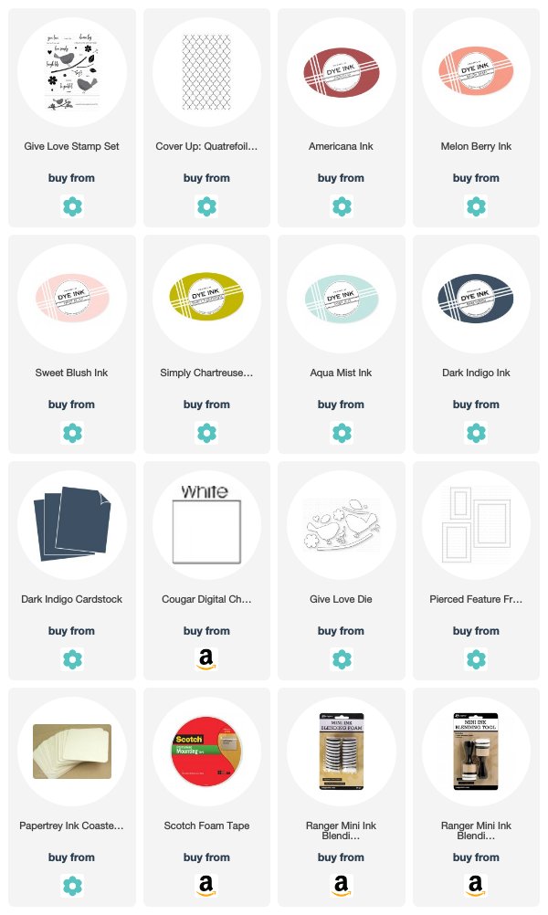
Supplies:


Like what you did with this card, Lizzie. The larger die cut in the framing lightens up the card so well. tfs
ReplyDeleteI love this transformation! you really opened it up with the rectangular window. It's such a fresh color palette!
ReplyDeleteBeautiful transformation.
ReplyDeleteYour transformed card has totally inspired me, Lizzie! I absolutely love how you used the quatrafoil stamp & the balance is perfect! Such a gorgeous card!
ReplyDelete