Pages

Saturday, June 30, 2018

Introducing The Bold Basics Stamp Set & Stencil Collection (And More Summer Perks!)

Good morning, friends and welcome to one last introduction from the Papertrey Ink June line-up! The Bold Basics collection from Kimberly Crawford is a versatile, modern basic that covers a wide range of occasions. You can use the stencils to create color blocked stationery that is super trendy and fresh or use them as a mask to create sections of background stamping. Let's take a closer look, shall we?

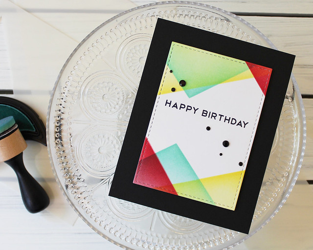
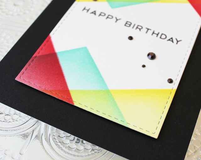
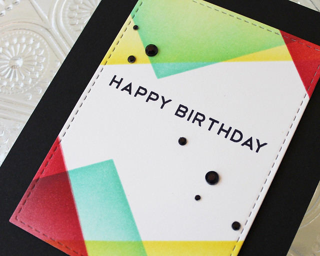
I used three of the Color Block stencils to get this overlapped triangular pattern on my focal panel. I wanted to create something a little more masculine and graphic and the stencils made it easy!

LizzieJones_PapertreyInk_June2018_BoldBasics_HappyBirthdayCard

I did my stenciling before my die cutting to make sure I was able to get in all the nooks and crannies created by the stitching detail on the die. I simply did a rough trim, did my sponging, and then die cut using a Noted: Simply Stitched die.

LizzieJones_PapertreyInk_June2018_BoldBasics_HappyBirthdayCard3

I kept the top and bottom reminiscent of one another, but still asymmetrical to keep the design from feeling too matchy. I stamped the sentiment from Bold Basics in True Black ink before adhering the panel to a True Black card front.

LizzieJones_PapertreyInk_June2018_BoldBasics_HappyBirthdayCard2

I knew I wanted to use some sort of sprinkled embellishment to add a touch of interest. I settled on rhinestones that I colored to match with a black marker. Lacquer dots (like Nuvo drops) would maybe have been a little more gender neutral, but I like the way these turned out. The slight sparkle is a nice touch.


You can pick up the Bold Basics stamp set and Color Block Stencil Collection bundle today for 10% off! It's a great incentive for a fantastic collection!

Thank you so much for joining me today! Make sure to pop in on Betsy, DawnHeather, Laurie, Melissa B, Melissa P, and Michelle to see what they have to share with you today. Enjoy your weekend and I'll see you again soon!

Supplies:

Friday, June 29, 2018

Design Team Tips: Negative Designs With Die Cuts

Good morning, friends! I'm popping in today for this week's Papertrey Ink Design Team Tips. I love using die cuts to create negatives in a stamped design, but sometimes the holes in the pattern leave unfortunate gaps that make the greeting illegible or the shape askew. My favorite way to help minimize those gaps is not only simple, but incredibly effective. A little sponging goes a long way, friends! I have three projects to share with you today that show this technique and the different looks you can achieve. Let's go!

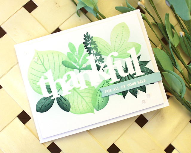
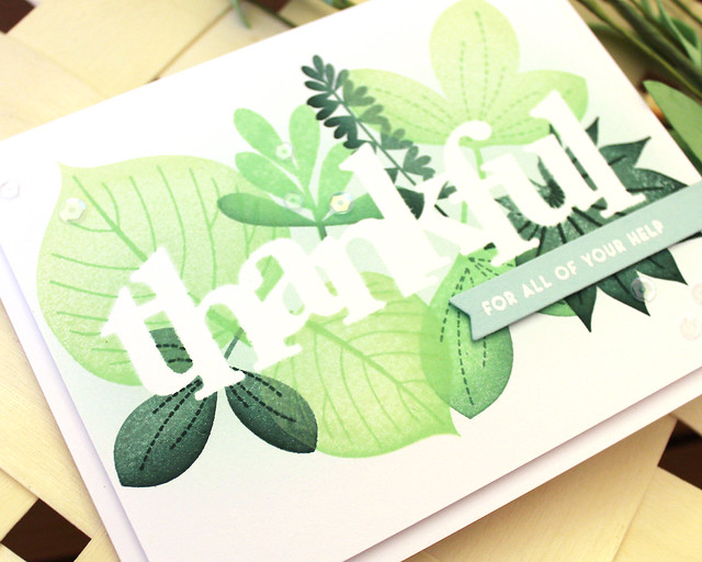
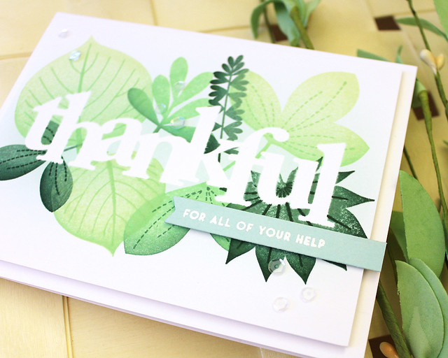
This first one shows how the sponging can make a negative word a little more legible. It defines the edges in the areas where the leaves (or flowers, or stars, or whatever image you choose to use) don't overlap the die cut.

LizzieJones_PapertreyInk_DesignTeamTips_ThankfulCard

I began by die cutting the Counting My Blessings "thankful" shape from full-stick Post-It notes. I like these notes because you can get a nice seal between the Post-It and the cardstock which keeps the die cut from shifting during the blending step. I blended with Aqua Mist ink on this one. I tend to choose the color of my blending based on the colors I'm going to be stamping for my pattern. I thought the light blueish color would look nice behind the leaves I planned to stamp.

LizzieJones_PapertreyInk_DesignTeamTips_ThankfulCard2

Speaking of those leaves, they're from the Leave It Be stamp set (which just happened to land on the Last Call list, so make sure to get it before it's gone). I used Mint Julep, Vintage Jadeite, Ocean Tides, and Pinefeather inks on the leaves, sponging lighter colors with darker ones to add depth.

LizzieJones_PapertreyInk_DesignTeamTips_ThankfulCard3

I removed the mask and adhered the panel to a white card base using foam tape. Then, I heat embossed a greeting from Sentiment Staples: Thank You onto an Aqua Mist banner. I adhered that to the card front with more foam tape and then embellished with a handful of sequins. They add just enough sparkle, don't you think?

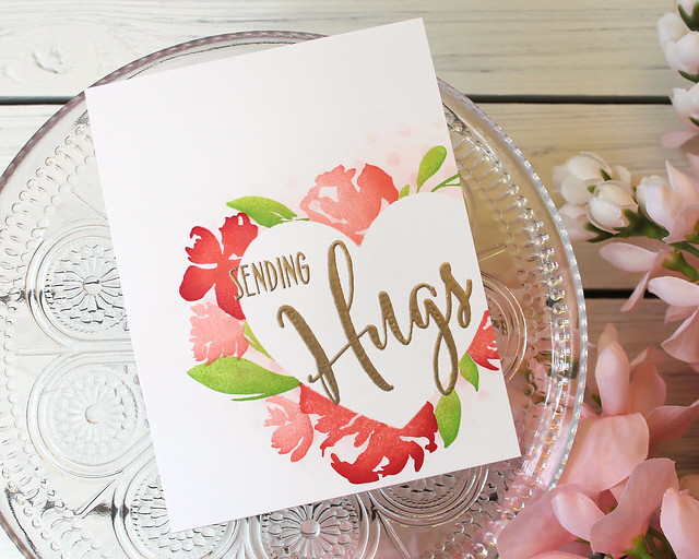
Next up, I have an example of stamping around the outer edge of a shaped die cut. Again, the sponging helps define the edges and fill in the gaps in the stamping. If you tried to completely overlap the images the design might get too cramped or busy, so the sponging gives you a little breathing room.

LizzieJones_PapertreyInk_DesignTeamTips_SendingHugsCard

I began this card by die cutting the Perfect Fit shape from the same Post-It notes I mentioned before. I stuck it to a white panel and blended on a bit of Pale Peony ink. I also sponged a bit of ink through the Stencil Basics: Dots stencil to give my design an added touch of texture.

LizzieJones_PapertreyInk_DesignTeamTips_SendingHugsCard2

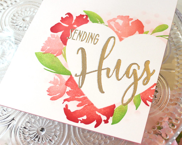
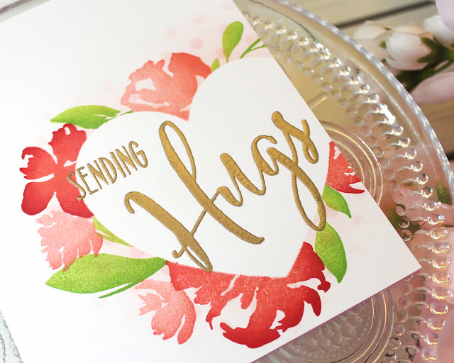
I continued by stamping the Botanical Bounty flowers and leaves around the outer edge of the heart shape. Again, if you don't want to overlap too much or crowd the images together the sponging will fill in the gaps so your masked area will still maintain its shape.

LizzieJones_PapertreyInk_DesignTeamTips_SendingHugsCard3

Once my stamping was complete, I removed the mask and heat embossed the Big Hugs sentiment in the opening. Then, I adhered that panel to a Pale Peony card base. One of the things I like so much about this technique is that you can create a card with loads of interest, but it can be nice and flat and easy to mail. No bulk required!

My last sample shows how you can use this same concept on the inside of a die cut shape (if you're, say, using the negative as your mask). Again, it's an ideal way to define your edges without having to add an extra layer of cardstock.

LizzieJones_PapertreyInk_DesignTeamTips_HelloCard

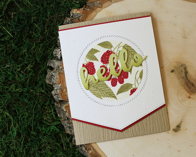
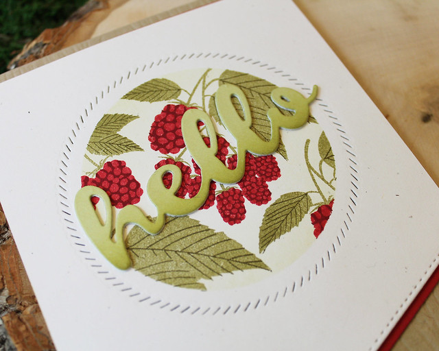
I began this one by die cutting a circle from a piece of text weight paper (I've also done this with vellum and that works well, too). I placed it on a Rustic White panel and then blended Spring Moss ink from the outside edge toward the center of the circle. I did a pretty light coat, so it might be a little difficult to see in the photos, but it makes a huge difference in person.

LizzieJones_PapertreyInk_DesignTeamTips_HelloCard2

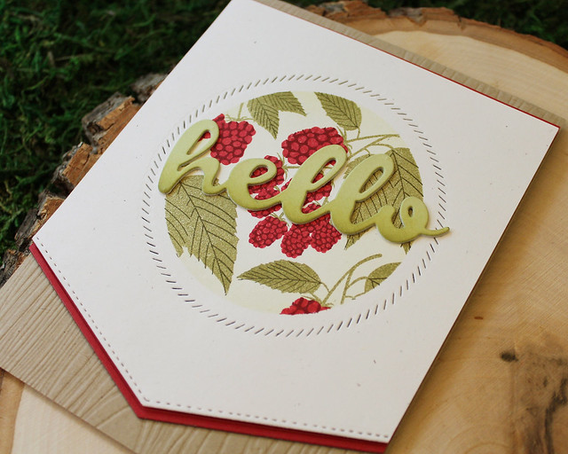
I continued by stamping the berry clusters from Beautiful Berries: Summer before removing the mask and using the Shape Shifters: Circle 2 border around the stamped area. Then, I die cut the bottom edge of the panel using the To The Point Edgers die and matted the top and bottom with Pure Poppy cardstock. I like the way the narrow Pure Poppy bits tie in to the berries without being overwhelming.

LizzieJones_PapertreyInk_DesignTeamTips_HelloCard3

Next, I adhered the panel to a Classic Kraft card base that I'd textured with the Woodgrain Impression plate. I created a nice bold greeting by stacking three You Deserve Flowers Sentiments die cuts. I cut the top shape from Spring Moss and sponged it with a bit of the matching ink to add depth.

I hope this little tip has helped you today. Thank you so much for joining me. Have a wonderful weekend and I'll see you again very soon!

Supplies:
Thankful Card

Sending Hugs Card


Hello Card
Wednesday, June 27, 2018

Simple To Spectacular: The Sweet Life

Good morning, friends! It's the last Wednesday in June and that means it's time for this month's Papertrey Ink Simple To Spectacular feature.


This has truly become one of my favorite features. I love coming up with a design and thinking of ways to progressively incorporate details that make the projects shine. The Sweet Life is a set that I've always really enjoyed using, but don't pull out nearly often enough. It was a pleasure to pull out these multi-layered blooms and leaves for my projects today.

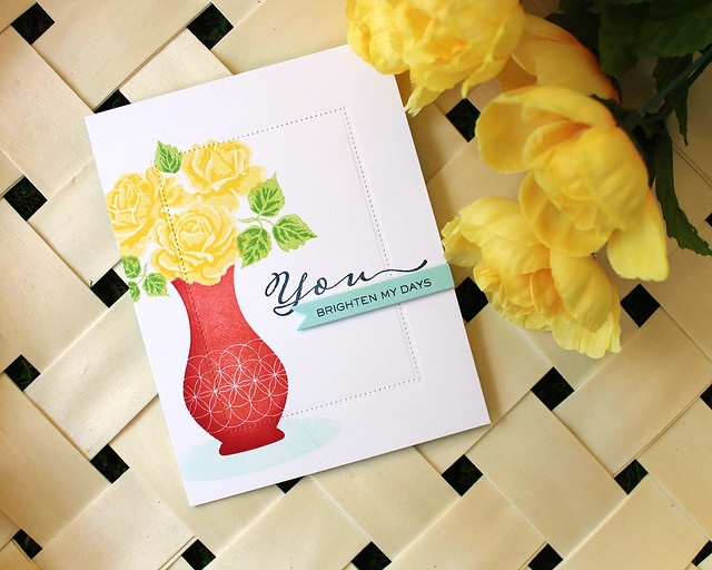
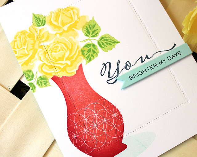
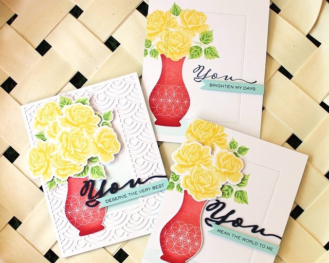
Let's start today with my "Simple" project. I liked the idea of tucking the roses into a vase, so I paired The Sweet Life with my Vogue Vases set.

LizzieJones_PapertreyInk_SimpleToSpectacular_June2018_TheSweetLife_YouBrightenMyDaysCard


I began by stamping the roses onto a panel of white cardstock using bright, sunny yellows. Then, I stamped the base image onto a sticky note and cut around it to create a mask. I masked the roses before stamping my vase. I did the same with the vase in order to stamp the shadow.

LizzieJones_PapertreyInk_SimpleToSpectacular_June2018_TheSweetLife_YouBrightenMyDaysCard2

Next, I stamped the "you" from Scripted onto the panel with Dark Indigo ink. Then, I used the pierced border from Mix & Mat: Pinked Edge to give the center of my panel a bit of definition and draw the eye inward. I really like that subtle detail.

LizzieJones_PapertreyInk_SimpleToSpectacular_June2018_TheSweetLife_YouBrightenMyDaysCard3

I adhered that panel to an Aqua Mist card base before attaching the small banner that I'd stamped with the Scripted sentiment. I love how clean and uncluttered this design turned out.

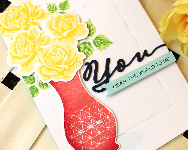
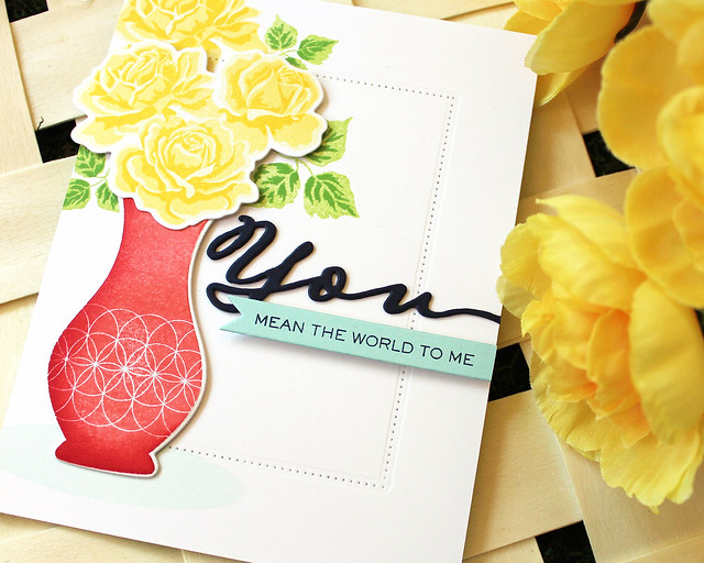
Next up, I have my intermediate design. I added dimension by using the coordinating die collection to include both flat stamped and die cut flowers.

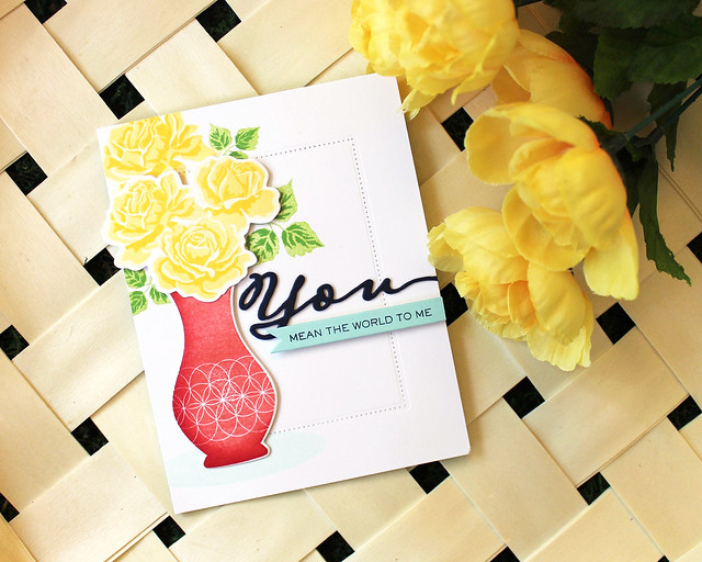
LizzieJones_PapertreyInk_SimpleToSpectacular_June2018_TheSweetLife_YouMeanTheWorldCard

Since I knew I was using die cuts, I was able to forego the masking that I did on the first card. Along with the stamped and die cut the roses, I also stamped a rose and a few leaf sprigs directly onto the white panel to give the bouquet more fullness.

LizzieJones_PapertreyInk_SimpleToSpectacular_June2018_TheSweetLife_YouMeanTheWorldCard2

Another "upgrade" on this version is the die cut sentiment in place of the stamped one from the "Simple" card. I stacked three die cuts together to create a thicker, more substantial shape and let it bleed off the edge.

LizzieJones_PapertreyInk_SimpleToSpectacular_June2018_TheSweetLife_YouMeanTheWorldCard3

I kept the die cut border and sentiment banner from the first card. On a series like this, I like to maintain a few of the elements from one card to the next.

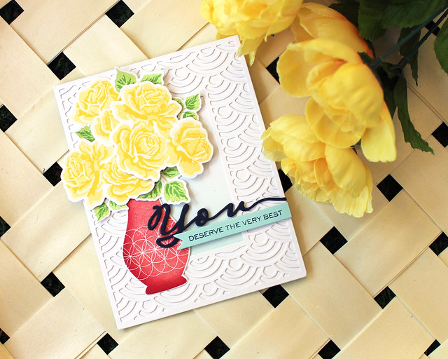
And lastly, I have my "Spectacular" version of the series. I made the bouquet much more substantial with additional roses and leaves and used a more decorative frame to draw the eye toward the focal point.

LizzieJones_PapertreyInk_SimpleToSpectacular_June2018_TheSweetLife_YouDeserveTheVeryBest

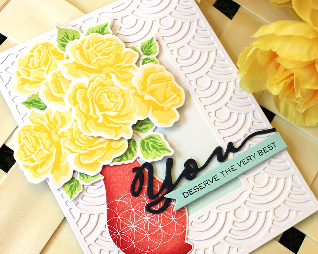
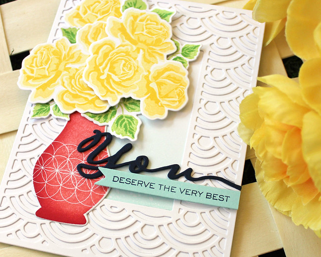
I began by stamping and die cutting all of my leaves, flowers, and a vase. Next, I die cut the Bold Borders: Wave frame and traced the opening onto a white card front. I masked off the edges and sponged Aqua Mist ink into the open space. Then, I added a touch of texture with some clean water speckles.

LizzieJones_PapertreyInk_SimpleToSpectacular_June2018_TheSweetLife_YouDeserveTheVeryBest2

I adhered the frame into place and arranged my vase and bouquet. I used both flat and foam adhesives to give my bouquet plenty of dimension.

LizzieJones_PapertreyInk_SimpleToSpectacular_June2018_TheSweetLife_YouDeserveTheVeryBest3

I used the stacked sentiment die cuts and banner to round out my design. I love how much texture the Bold Borders: Wave frame adds to this version!

LizzieJones_PapertreyInk_SimpleToSpectacular_June2018_TheSweetLife_YouCardTrio

That's all I have for you today. I hope you've enjoyed this fresh look at The Sweet Life! Thank you so much for joining me! Make sure to pop in on Dawn McVey and Melissa Phillips to see how they're using this wonderful floral set today. Enjoy your Wednesday and I'll see you again soon!

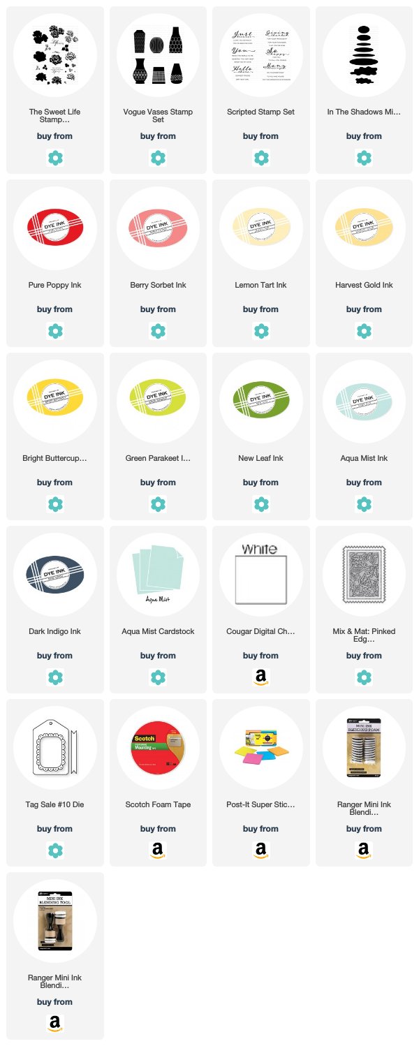
Supplies:
You Brighten My Days Card

You Mean The World Card

You Deserve The Very Best Card

Sunday, June 24, 2018

Introducing Glorious Globes: June & More Summer Perks!

Good morning, friends! I'm popping in today with the rest of the Papertrey Ink team to introduce my new Glorious Globes: June mini set. The June edition includes a stack of luggage and a couple of handy travel sentiments that you can use with the rest of the sets in this series. The luggage can act similarly to the travel journals in the original Glorious Globes: Basics set to add interest to your globe arrangement or you can use them independently for all sorts of travel theme projects!

I put together a short video to give you a closer look at the Glorious Globes series that I hope you enjoy (please excuse all of the "um"s and "you know"s). I talk briefly about the thought process behind the series and how it came to be.


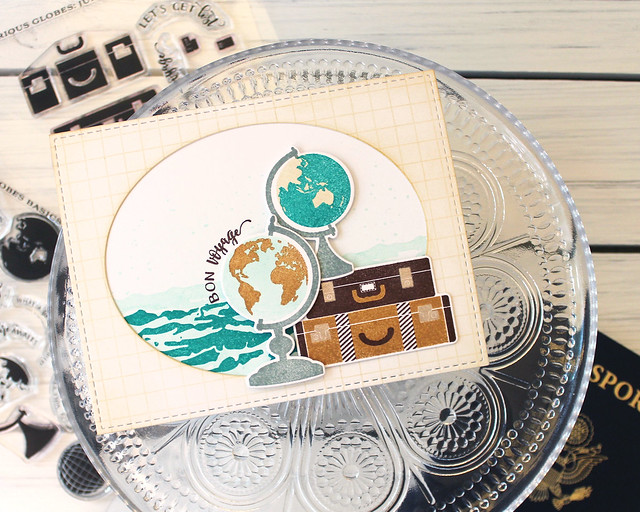
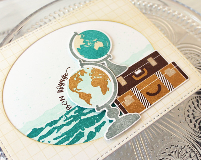
I also have a project to share with you today! I paired the Glorious Globes: June with the Basics set and Dawn's new Cover Up: Grid and Betsy's Text & Texture: Ocean to create a fun bon voyage card.

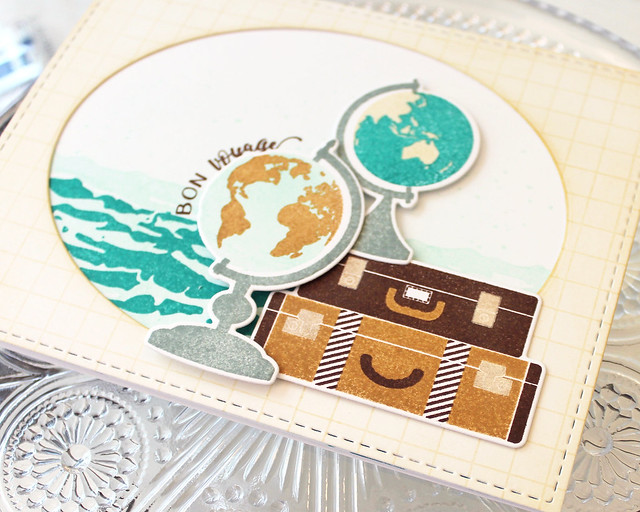
LizzieJones_PapertreyInk_June2018_GloriousGlobes_BonVoyageCard
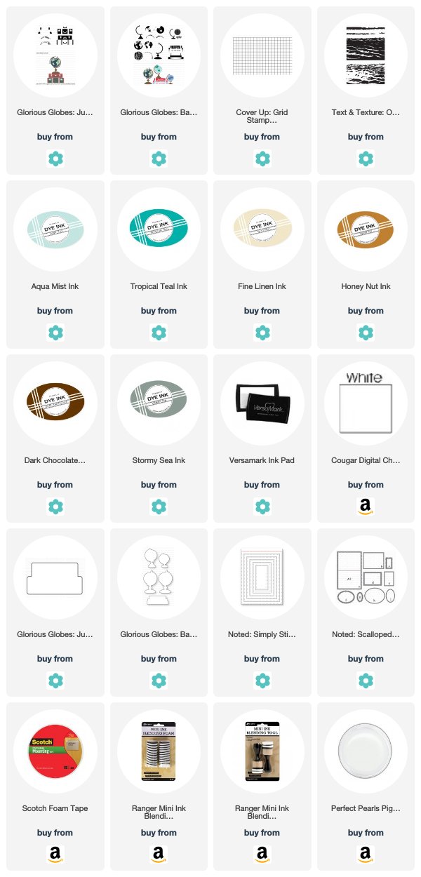
I began by lightly sponging a white card base with Aqua Mist ink. I splattered on a few speckles for interest and then stamped the ocean in Aqua Mist and Tropical Teal inks. I sponged white cardstock with Fine Linen ink and stamped that with the Cover Up: Grid before die cutting with the Noted: Simply Stitched panel and an oval to create a window. I adhered that to the card front and set it aside.
LizzieJones_PapertreyInk_June2018_GloriousGlobes_BonVoyageCard2

Next, stamped and die cut the globes from the Glorious Globes: Basics and luggage from the Glorious Globes: June set. I used browns on the luggage to give them a warm, vintage vibe. The luggage is split up into three stamps. One does the top suitcase and details on the bottom suitcase while the other does the bottom suitcase and handle on the top. The third does the latches on both suitcases. I stamped my latches once in Classic Kraft and then went back with Versamark and pearl pigment powder to give them a lustrous, metallic finish.

LizzieJones_PapertreyInk_June2018_GloriousGlobes_BonVoyageCard3

I adhered the suitcases to the card front and laid the globes in place before stamping my sentiment (also from Glorious Globes: June). Then, I used dimensional adhesive to adhere the globes in place and give my arrangement some depth. I love how the sentiment hugs the curve of the globe!


If you've been curious about this series but have yet to give them a try, we have a bonus for you! Papertrey is offering 10% off of select Glorious Globes products for the next few days.

Thank you so much for joining me today! Make sure to pop in on Betsy, Heather, Laurie, Melissa B, Melissa P, Michelle, and Stephanie to see what they have to share with you today. Enjoy the rest of your weekend and I'll see you again soon!

Supplies:

Thursday, June 21, 2018

Throwback Thursday: Zappy Birthday

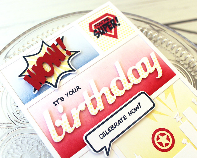
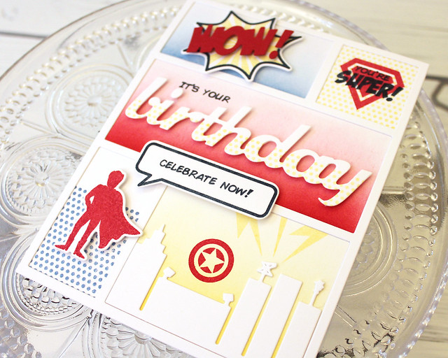
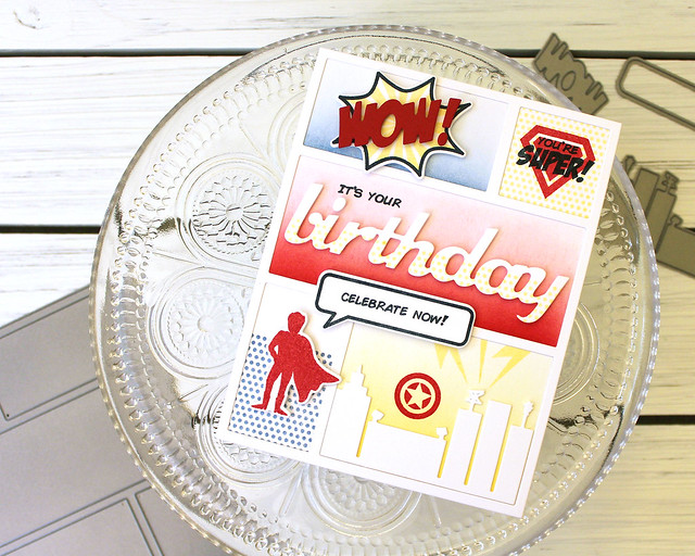
Hey there, Papertrey Ink fans, and welcome to this week's Throwback Thursday feature! Today Heather, Laurie, and I are revisiting Lexi's Zappy Birthday set. My husband is a big comic book fan and he has a big birthday coming up. It's been awhile since I last pulled out Zappy Birthday, but it seemed like the perfect set to use to create a special card that would be right up his alley. I paired it with the coordinating Superhero set and the Cover Plate: Comic Strip and I have to say...I'm totally smitten all over again!

LizzieJones_PapertreyInk_ThrowbackThursday_ZappyBirthday_ComicBirthdayCard

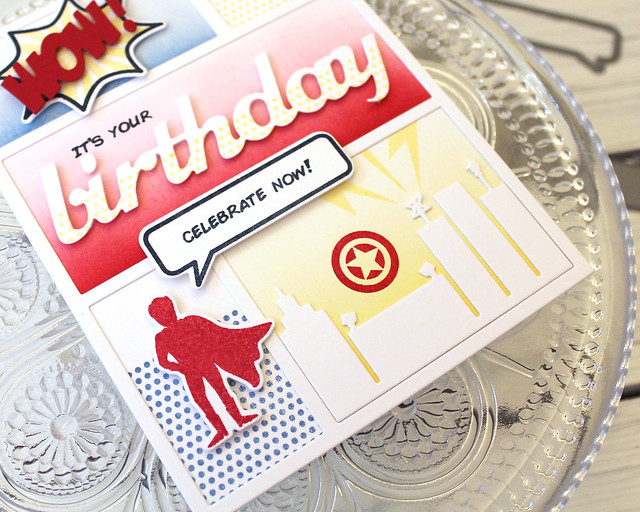
I began by die cutting the Cover Plate: Comic Strip shape and traced out the openings so I knew exactly where the cover plate would fall when I glued it down. I sponged Blueberry Sky, Pure Poppy, and Harvest Gold inks into three of the openings and stamped the dotted background from Superhero in the other two before adhering the die cut into place.

LizzieJones_PapertreyInk_ThrowbackThursday_ZappyBirthday_ComicBirthdayCard3

I stamped and die cut the burst image from Zappy Birthday and the "Wow!" using the coordinating Zappy Birthday die collection. I adhered the "Wow!" to the burst with foam tape and the burst to the card front with more foam tape. The next square I stamped with the shield from Superhero and the sentiment from Zappy Birthday.

LizzieJones_PapertreyInk_ThrowbackThursday_ZappyBirthday_ComicBirthdayCard2

For the large central rectangle, I simply die cut a "birthday" greeting using the Birthday Trio Die Collection and stamped it using the same dot pattern from Superhero. I placed it where I knew I wanted to adhere it and used a greeting from Zappy Birthday to complete the message. The original sentiment said "It's your day!" so I just masked off the last bit to make it work the way I needed it to.

LizzieJones_PapertreyInk_ThrowbackThursday_ZappyBirthday_ComicBirthdayCard4

I stamped and die cut the caped crusader from Superhero for the bottom right corner and used the sentiment and speech bubble from Zappy Birthday to give him a voice. In the final rectangle, I used the lightning bolt from Zappy Birthday to create "broadcasting" vibes for the Zappy Birthday Die tower and the star emblem from Superhero to call the defender-in-chief for his birthday party.

I think my very own super hero will love this card for his birthday! Make sure to check in with Heather and Laurie to see how they've used Zappy Birthday today. Enjoy the rest of your week!

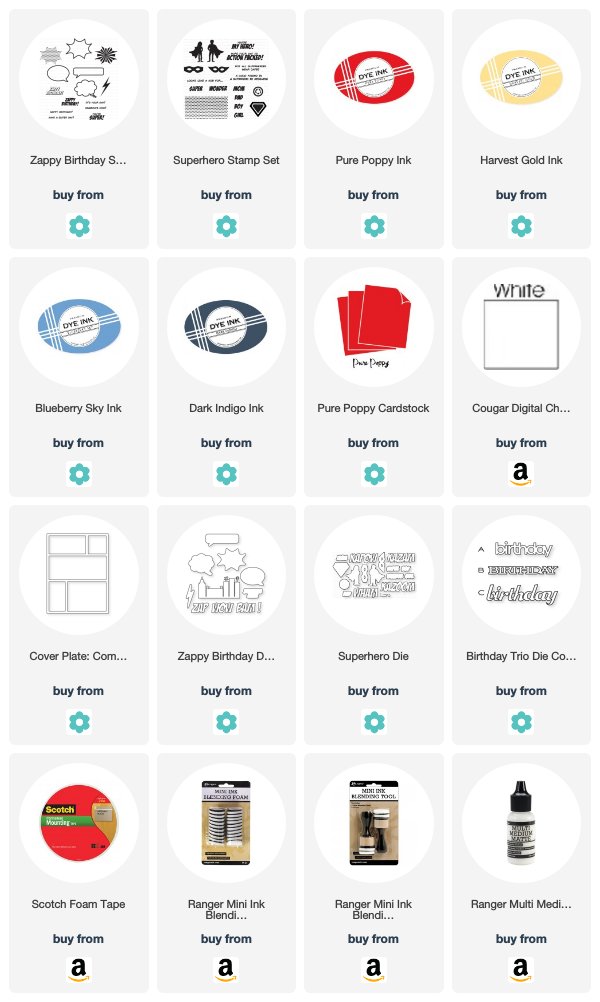
Supplies:

Wednesday, June 20, 2018

Introducing Cover Up: Grid and Summer Perks!

Good morning, friends! I'm popping in today to help introduce Dawn McVey's new Cover Up: Grid stamp set and announce a fun Summer promotion series from Papertrey Ink. Throughout the Summer Papertrey will have intermittent releases from some of your favorite designers along with a special promotion on select coordinating products.


With today's Cover Up: Grid release you can pick up one of Dawn's other Cover Up stamp sets at a 15% discount (for a limited time)! This is a great opportunity to check out this series!

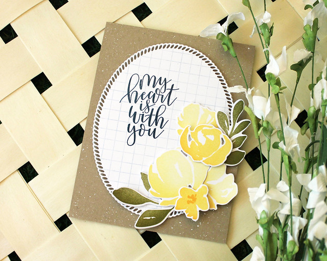
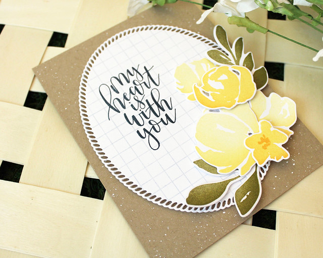
I have a card today to help welcome the newest in the series, so let's get to it! I paired this grid background with the new Botanical Bounty II and Shape Shifters: Oval II die. Don't you just love straight lines with florals?

LizzieJones_June2018_PapertreyInk_CoverUpGrid_BotanicalBounty_MyHeartIsWithYouCard

I began by stamping the Cover Up: Grid onto white cardstock using Spring Rain ink before die cutting it with the Shape Shifters: Oval. The contrast of the straight lines with the lacy edge of the die cut makes my heart sing, y'all! Next, I stamped the Penned Elegance sentiment using Dark Indigo ink.

LizzieJones_June2018_PapertreyInk_CoverUpGrid_BotanicalBounty_MyHeartIsWithYouCard2

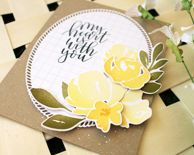
I splattered a Classic Kraft card base with Copic Opaque White Pigment and adhered the oval to the center with foam adhesive. Then, stamped and die cut several flowers and leaves from Botanical Bounty II, using sponging to add depth and interest.

LizzieJones_June2018_PapertreyInk_CoverUpGrid_BotanicalBounty_MyHeartIsWithYouCard3

I arranged the flowers along the edge of the oval using flat and foam adhesives to give dimension. I'm totally digging the different yellows in this bouquet!

I hope you've enjoyed today's post! Make sure to check out Betsy, Dawn, HeatherLaurie, Melissa B, Melissa P, Michelle, and Stephanie's blogs to see what they have up their creative sleeves for you today. Have a great day and I'll see you again soon!

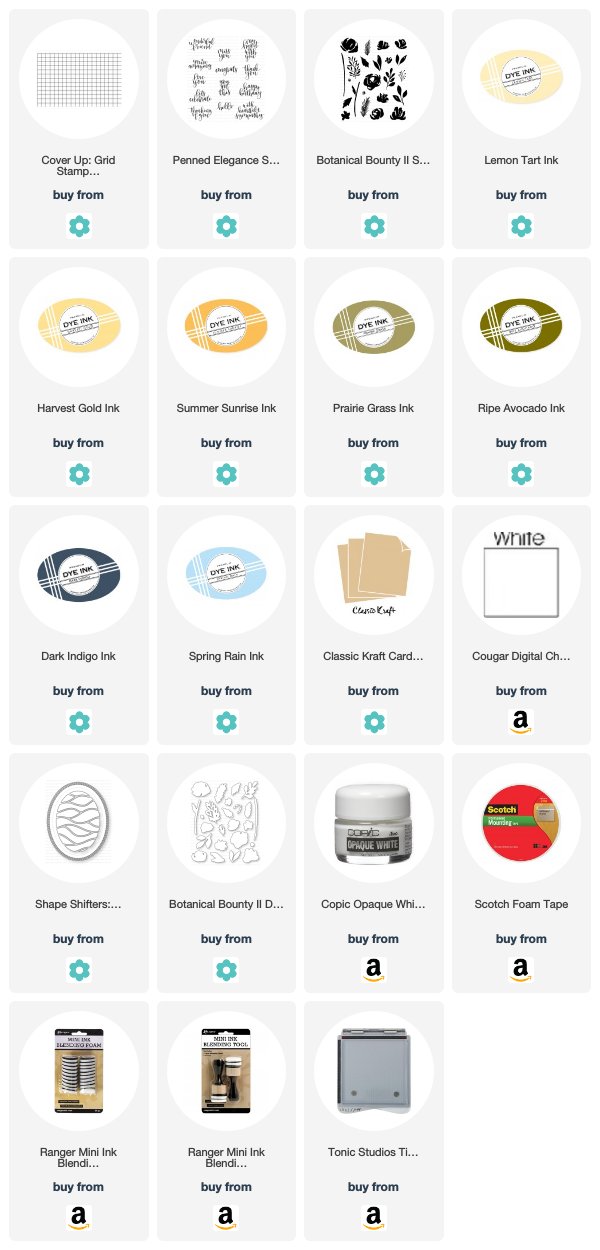
Supplies:

Tuesday, June 19, 2018

Transformation Tuesday

Good morning, friends, and welcome to this week's Papertrey Ink Transformation Tuesday. This week I thought it would be fun to take a masculine/rustic project that I created last November and give it a more feminine spin.

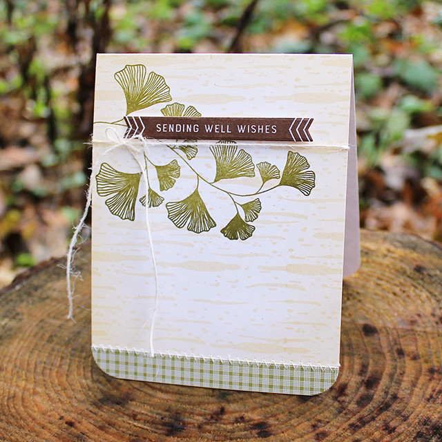
Here's my original card (click HERE to see the original post):

Ginkgo Well Wishes Card

I created it to introduce the Direct Messages stamp set and I really liked how the ginkgo branch pointed directly to my greeting, highlighting it nicely. I also really liked the patterned paper stitched to the bottom edge and the stamped background with soft blending around the edges of the card base. I thought these were elements that would translate well to a softer, more feminine design so that's the direction I decided to go.

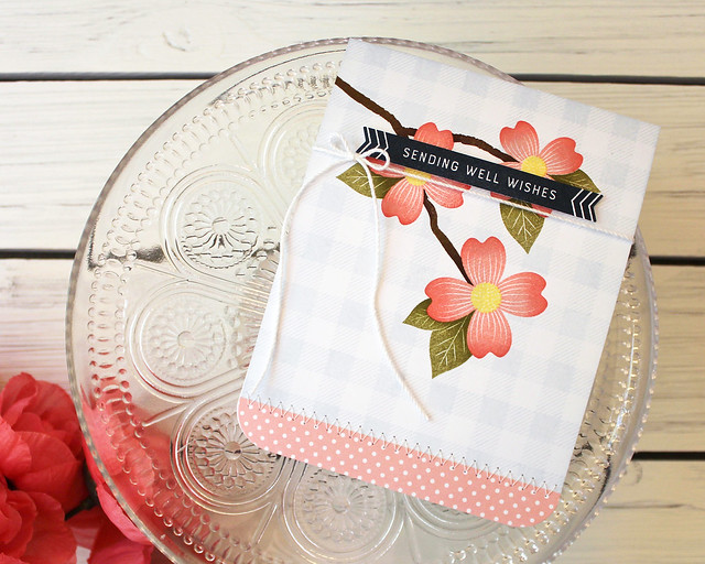
LizzieJones_TransformationTuesday_PapertreyInk_DogwoodSendingWellWishesCard

I wanted a branchy sort of image to highlight my greeting again, but I didn't want to use the same set. I opted for the dogwood branch from Warm Regards instead. I love that the flowers snuggle around the sentiment and add a splash of color. I blended Pale Peony and Berry Sorbet inks on the petals to create depth and give them a realistic appearance. We recently planted a Cherokee dogwood and I can't wait for it to bloom next Spring and show off those lovely pink blossoms!

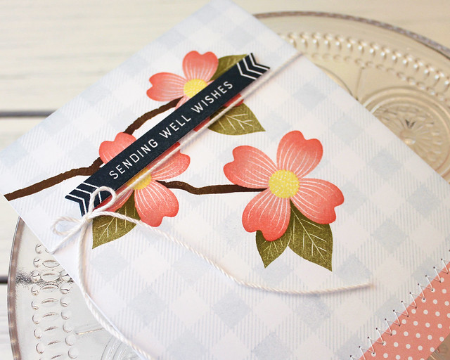
LizzieJones_TransformationTuesday_PapertreyInk_DogwoodSendingWellWishesCard3

I also wanted to incorporate that same background treatment on the new card. I used Spring Rain ink around the edges of my white card front to give a soft, dreamy quality and stamped the gingham pattern rather than the birch background from the original. The gingham pairs nicely with the dogwood images and it gives the card a homespun feel that makes me happy.

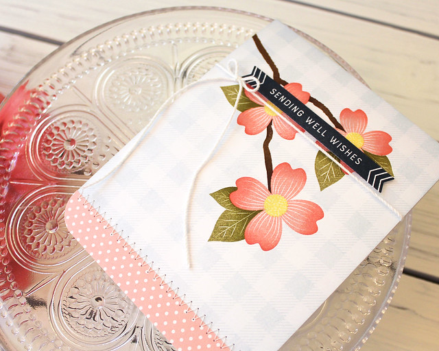
LizzieJones_TransformationTuesday_PapertreyInk_DogwoodSendingWellWishesCard2

I chose to use a swiss dot patterned paper to embellish the bottom edge and stitched it on using the same zig-zag stitch as the original. I also used the same sentiment and bow, but this time I used white crochet thread instead of jute twine to give the card a more polished appearance.

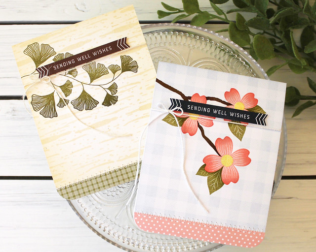
LizzieJones_TransformationTuesday_PapertreyInk_SendingWellWishesCards

All in all, I think this challenge to myself worked out quite well! I know some of us have a hard time with masculine cards. If you do, maybe look at the two cards side by side and see if you can get an idea of how you can "reverse engineer" a more masculine design from a feminine one (even though I did the opposite here). Sometimes just seeing two versions of the same card next to one another makes a world of difference.

Thank you so much for joining me for this week's Transformation Tuesday! I hope you'll head over to the Team Blog to link up your own project for your chance to win a $25 gift certificate!

Supplies: